Color Psychology in Gaming: Enhancing Your Experience
Color Psychology in Gaming – How Colors Influence Your Mind and Play
In gaming, milliseconds and emotions matter. What if the colors around you—both in the game and in your setup—could sharpen your reactions, keep you calm under pressure, and pull you deeper into the story?
Color psychology in gaming is the study of how visual tones affect mood, focus, and performance. Whether you’re a competitive player chasing precision or an explorer seeking immersion, understanding the mental effects of color can transform both gameplay and design.
📚The Basics of Color Psychology in Gaming
🎭 Emotional Triggers by Color
Red & Orange → Urgency, adrenaline, excitement. Ideal for fast-paced action.
Blue & Green → Calmness, stability, focus. Perfect for strategy and puzzle games.
Purple & Pink → Creativity, mystery, fantasy. Common in RPG and immersive worlds.
Game designers use these associations to guide emotions and behavior, from ramping up tension to creating moments of release.
🌍Cultural Variations in Color Perception
Colors don’t speak the same language everywhere:
Red: Joy and luck in China, danger in Western cultures.
Black: Elegance in Europe, mourning in parts of Asia.
Global game design adapts palettes to resonate with different audiences while maintaining core gameplay psychology.
How Colors Boost Gaming Performance
👁️ Enhancing Focus & Reducing Fatigue
Balanced, soft tones help maintain concentration, reduce eye strain, and prevent sensory overload during long sessions.
💡 Tip: Avoid overly bright, high-saturation backgrounds that tire the eyes.
🚀 Improving Reaction Time
High-contrast colors make critical elements—like health bars or enemy indicators—instantly recognizable, shaving valuable milliseconds off response times.
🖼️Colors as a Tool for Immersion and Storytelling
Genre-Specific Color Palettes
Horror → Muted tones, deep shadows for suspense.
Adventure → Bright, varied palettes for exploration.
Sci-Fi → Neon contrasts, cool metallics for futuristic environments.
World-Building Through Color
Greens & earth tones → Safe, organic environments.
Dark blues & grays → Dystopian or threatening worlds.
Warm reds & golds → High-energy, competitive spaces.
🌟Notable Examples in Gaming
Journey – Soft, warm tones encourage calm exploration.
Overwatch – Bold, vibrant colors aid quick recognition of characters and abilities.
Cuphead – Vintage-inspired palettes evoke nostalgia and charm.
🖥️ Applying Color Psychology to Your Gaming Space
🎨 Choosing the Right Colors
Soft blues & greens → Focus, strategy, calm.
Vibrant reds & oranges → Energy, fast-paced reflexes.
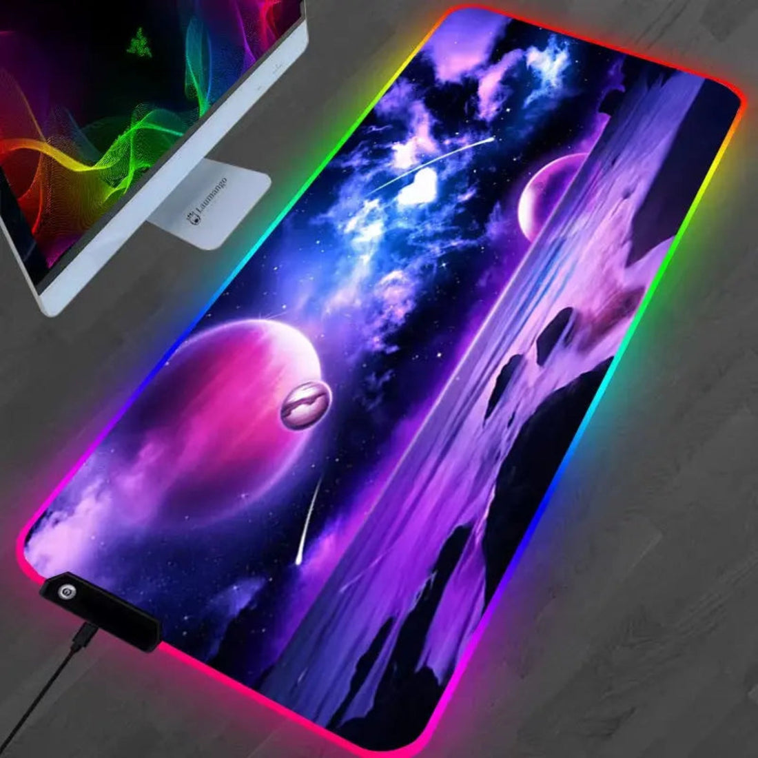
Purples & neons → Immersive, futuristic moods.
💡 Enhancing with Lighting
Adjustable RGB lighting lets you switch moods per genre—cool tones for focus, warm tones for relaxation.
Pro Tip: Sync in-game events with dynamic lighting for deeper immersion.
🎯 The Competitive Edge of Color
Mastering color psychology in gaming is more than a design choice—it’s a performance strategy. By aligning color with mental states, both players and developers can elevate focus, speed, and emotional connection to the game.
Your next big win might just come from the color on your screen.
💬 FAQ – Quick Insights
Q: What is color psychology in gaming?
It’s the study of how colors influence player emotions, focus, and behavior in games.
Q: Can colors really improve gaming performance?
Yes—high-contrast visuals, calming tones, and intentional palettes enhance reaction times and focus.
Q: What colors are best for my gaming setup?
Choose tones based on your playstyle—calm colors for strategy, energizing colors for action, immersive colors for roleplay.
